Excel Charts
Introduction
Charts are a way of graphically representing the data in your spreadsheet. Often the sheet will be quite complex so a chart gives the information in a more understandable format - a picture says a thousand words.
Simple chart
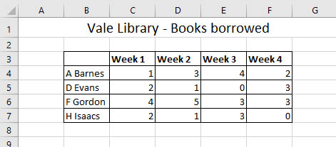
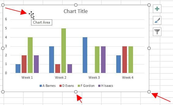
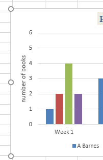
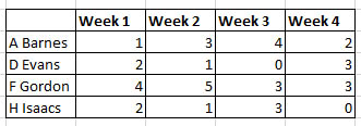
In this example, we'll look at how to create a chart and make some simple changes to it. The sheet below shows the number of books borrowed per library customer over a 4 week period.
Inserting a chart
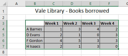
- Select the data you want to show in the chart - include the headers as these can be used as chart labels. In this case that will be the cell range B3:F7. Sometimes you might want to select data that is non-contiguous (separate selections that are not next to each other). This is covered in the selection section.
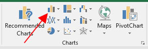
- Click the Insert tab on the ribbon and go to the Charts section. Click the Column chart button as this will suit our data.
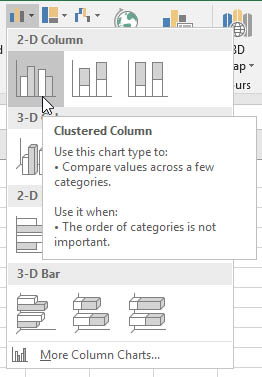
- Column chart options will be shown below. As you move the mouse over each option, you'll see a description and a preview of the chart. Choose a 2-D Clustered Column
- The chart will now be on your worksheet. If you move the mouse pointer over the chart, you'll see it shaped like a 4-pointed arrow. Click and drag to move the chart to another part of the sheet. There are also handles around the border of the chart that can be used to resize it.
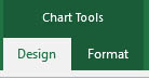
- Whenever a chart is selected there will be additional tabs on the ribbon with tools to change the design and format of the chart
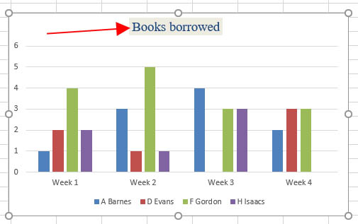
- Click in the Chart title and type Books borrowed. You can use tools on the Home ribbon to change the font, size, colour etc.
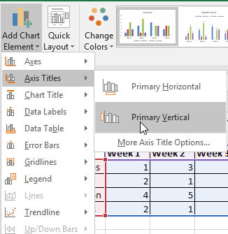
- Go to the chart Design ribbon tab and click the Add Chart Elements button on the far left. Add a Primary Vertical Axis title. The horizontal access is also known as the x-axis and the vertical axis is the y-axis
- Type number of books in the y-axis title box. You can format this title as before.
top of page
Chart types
There are many chart types to choose from in Excel, and there are options within each type - for example if you select a column chart you could have a 2-D or 3-D or stacked column. You should choose a chart that suits your data (for example, how many data series do you have) and that shows what you want to communicate about that data.
Column chart
The above chart is a clustered column. These charts normally show the categories (weeks & customers) on the x-axis (horizontal) and values (number of books) on the y-axis. They are useful when there is more than one data series.
A data series is a row or column of numbers to be used in a chart
In the example above, we have 4 rows and 4 columns, so there are at least 4 data series to include in the chart.
Pie chart
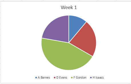
Pie charts can show only one data series. They are useful for showing proportions of the total, for example populations within the UK.
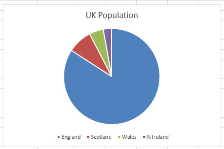
A pie chart wouldn't suit our data above as there's more than one series, unless we only wanted to show one customer or one week.
Line chart
Line charts can show multiple data series and can be used to look at how values change over time - like sales figures or share prices. They are useful to see trends in your data.
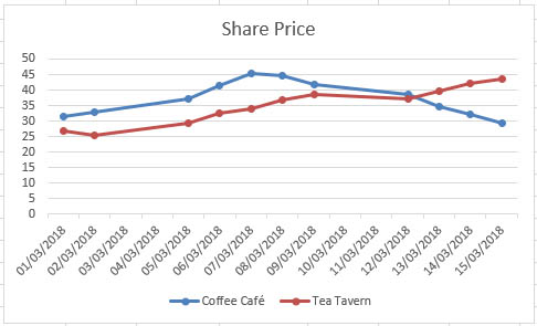
A line chart could be used for our library data, but the column chart makes the data clearer.
top of page